 It's a snowing, blowing mess outside and so instead of doing much needed house work, I spent the afternoon at my craft table and worked on a set of cards. I have several thank you's to send out and after this weekend at the TAC Kansas Roundup in Salina I was inspired by one of the projects to make these cards.
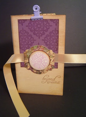
 Here is the outside of the original project designed by Heather Scott. It is a folio with a checklist on the inside.
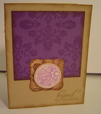
I LOVED the design of the folio and so I adapted it for a card...or two...or eight. I basically used the same design and challenged myself to use the same similar pieces on each card but yet make each card slightly different than the others. Here's what I came up with (bare with me as there are A LOT of pictures!!).


 Here is a closeup of the image popped up on pop dots.
The cardstock paper is TAC's Kraft Cardstock (GREAT stuff!!) and the patterned paper is from TAC's Toodle Loo & Angelee Paper Packs. The sentiment is from the TAC "More Abundance" stamp set and the circle image is from TAC's "Forever Family". Each of the pieces has been distressed using Burnt Umber Palette Ink & a sponge. The main image was stamped with either Spring Pansy or Aloe Vera VersaMagic or Seascape Palette ink. The image on the purple cardstock (from TAC Puples paper pack) is from the TAC "Victorian Elements" set and it has been stamped with VersaMark onto the cardstock. I LOVE this new set!!

3 comments:
So beautiful.I like the color combination. Thanks for sharing.
These are so pretty!! You should do something simple like this for seminar!! Is that a punch you used behind the circle? SU?
These are just gorgeous!!
Post a Comment