Wednesday, March 31, 2010

Congrats!

Yesterday I showed you a card that I made that used a piece of patterned paper made with "Distressed Stripes" and a couple other stamp sets.  Today I wanted to show you a 2nd card that was also made with this same stamped paper.  It is very simple and also VERY similar to several cards that I posted last week only this time I also used a piece of tiny patterned paper that I had left over (I have one more card that I made using this same paper).


This is a card that could be made with any patterned papers and I'll probably try this same layout again!  I think it adds an extra specialness though that it is all hand stamped!


In the photo above, you can see the paper detail a little more closely!


Hope you enjoyed the card today!  Thank you for stopping by!  I'd love to hear what you think!

Supplies: 
Stamps: PTI Distressed Stripes, Fancy Flourishes, Turning a New Leaf, Butterfly Dream, Signature Greetings

Ink: PTI Sweet Blush, Raspberry Fizz, Hawaiian Shores, Summer Sunrise & Spring Rain. Jumbo Java & Pixie Dust VersaMagic and Palette Bordeaux, Chartreuse & Orangerie
Paper: PTI Rustic White & TAC White Ultrasmooth
Other: PTI Butterfly Die, Stickles

Tuesday, March 30, 2010

Custom Background Paper

You are going to be so sick of "Distressed Stripes" before long!  I just can't quit using them!  I find inspiration everywhere for this set of stamps!

I had SOOOO much fun making this paper and these cards.  I want to show you the paper first. 


That paper started out as a piece of PTI Rustic White!  I used quite a few colors and stamps to turn it into this!  I started with the "Distressed Stripes" stamp set and used PTI Sweet Blush, Raspberry Fizz, Hawaiian Shores, Summer Sunrise & Spring Rain inks.  Then, I also added Jumbo Java & Pixie Dust VersaMagic and Palette colors Bordeaux, Chartreuse & Orangerie.  After I stamped that, I stamped a leaf image from "Turning a New Leaf" with Hawaiian Shores around the edges.  Then, I used a swirl from "Fancy Flourishes" in Vintage Cream ink and stamped on top of all that, also staying around the edges.  And, wa-la!!  I love the end result.

I made 3 cards using this one small piece of paper.  I'll share my favorite of them with you today (and yes, this is my 2nd post for today!).


I am so happy with how this turned out.  I love, love all the color in it!  The buttons on the side of the label are chocolate brown but I realize that it's hard to tell from this photo.


Here's a closeup of the stamping so you can see a little more of the detail.  I used a scalloped stamp from Hero Arts to kiss off some of the ink in a few of the largest solid stripes.  You can see this a little on the bottom bordeaux strip.


I also had to share the back with you!  I did something fun and stamped polka dots in Hawaiian Shores ink all across the back.  I thought it added a fun detail!  I also stamped my custom designed-by stamp on there too (but don't look TOO close because I smudged it a little). 


Thank you so much for stopping by!  Be sure to check back tomorrow and I'll share the 2nd of the cards I made using this paper.  I'd love to hear your comments!

Supplies:
Stamps:  PTI Distressed Stripes, Fancy Flourishes, Turning a New Leaf, Fillabel Frames 2, Vintage Labels, Polka Dot Basics
Ink:  PTI Sweet Blush, Raspberry Fizz, Hawaiian Shores, Summer Sunrise & Spring Rain. Jumbo Java & Pixie Dust VersaMagic and Palette Bordeaux, Chartreuse & Orangerie
Paper:  PTI Hawaiian Shores, PTI Rustic White
Other:  PTI Chocolate Brown Buttons, Tan Scrapper's Floss, Labels 4 Nestabilities, Ribbon, Pop Dots

Butterfly Thank You

Here's another card with Distressed Stripes.  This is my least favorite of the three cards that I've shown you  using this set, but I do like how the background and butterfly turned out.


I really like this butterfly stamp set!  I used the rock and roll technique on the butterfly to get it to be two tones.  It's just so soft and pretty!


And, I really like the softer stripes too.  There are just so many looks that can be created with this Distressed Stripes set!  The ribbon is from Hobby Lobby and I really like the softness of it too!

Thanks for visiting!  What do you think of the new Distressed Stripes set?  Have you purchased it yet?  Is it on your wish list?  I'd love to see what you've done with it!

Monday, March 29, 2010

Striped Borders


Here's another card using PTI's new "Distressed Stripes" stamp set.  I LOVE this set!  I found the inspiration for this pattern from a piece of patterned paper I found online but I have searched and searched for it so I could show you the comparison and I can't find it anywhere.  So, you'll just have to trust me that it looks as good, if not better than the printed paper!


Here's a closeup of the stripes.  The colors I used are PTI Hawaiian Shores, Terra Cotta Tile, Spring Moss, Palette Giverny Green & Orangerie & Jumbo Java VersaMagic and they are stamped on ivory paper.  Aren't those mini pom poms cute?  I ordered those from an etsy shop called Sugar Pink Boutique.  Be prepared if you click on that link because she has some CUTE stuff and you will want some! :)


Here's a closeup of the flowers on the Asian Fusion flowers.  I used small brown pearls on some of the flower blooms.  I like the extra little detail it adds.  I also used one of the Tea Dye Duo inks from PTI around the edge of the rustic white paper.


Thanks for stopping by!  I hope you liked the card! 

Supplies
Stamps:  PTI Distressed Stripes & Asian Fusion
Paper:  PTI Rustic White, Terra Cotta Tile & Hawaiian Fusion
Ink: PTI Hawaiian Shores, Terra Cotta Tile, Spring Moss, Palette Giverny Green & Orangerie & Jumbo Java VersaMagic
Other:  Fiskars Border Punch, Brown Pearls, Pop Dots, Mini Pom Pom trim,

Saturday, March 27, 2010

Seeing Stripes

I am so in love with the new PTI "Distressed Stripes" stamp set!  I don't usually envision a card before I even start working with a set, but this time I had (have) all kinds of ideas rolling around in my head!  I finished 3 cards pretty quickly and I am just very excited about the possibilities that this set lends!  I wanted to share one of the striped cards today.


I just LOVE the new Hawaiian Shores PTI color!  And, paired with Raspberry Fizz...wow!! :)  See that striped background paper?  Yep!  It was made with the new stamp set!  See what I mean by LOTS of possibilites!?


Here's a closeup of how I did the layers and you can see the stripes in a little more detail as well.  I have started using pop dots that are not quite as thick so that it doesn't create quite as much dimension and is easier to mail.  Oh, and the sentiment...LOVE!


I hope you enjoyed today's card!  Thanks for stopping by!  I will be showing you more with this set soon!  Also, I'm going to be playing with my blog a little in the next week or so, so if it looks different, don't be alarmed!  It's getting a little facelift! :)

Supplies
Stamps:  PTI Distressed Stripes, Polka Dot Basics, Star Prints
Paper:  PTI Rustic White, Raspberry Fizz
Ink:  PTI Raspberry Fizz, Hawaiian Shores & Palette Noir, PTI Tea Dye Ink
Other:  Fiskars Star Punch, Pop Dots

Thursday, March 25, 2010

Button Lovers Unite! PTI Blog Hop


Welcome to the March Papertrey Ink Blog Hop!  This month's theme is all about buttons and our challenge was to use PTI buttons on a project...however we wanted!

Well, I decided to have some fun with this one!  I've attemped several times to make my own button rings!  I love the look of them, they are just so fun!  So, when I saw this theme was buttons, I decided to pick up my tools and give it another try.  Now, I am just a novice and am just beginning to learn how to do this and I taught myself by watching videos, so these pieces are by no means perfect! :)  (Be prepared, there are A LOT of pictures!)

But first, let's start with the packaging!


Here's the box open:


And, what is inside...

 
Here's a closeup view of the jewelry inside that is made with PTI Vintage Buttons. 


On the necklace pendant I used Hawaiian Shores buttons on the base and as the top piece also.  I LOVE the sparkly Raspberry Fizz button in the middle!  The three buttons are glued on to the back of a jewerly pendant base.


Here's a view of the duo together.  I love that ring too!  The colors are just so fun!


The photo above shows the ring you already saw above, plus two others made using the Hawaiian Shores & Chocolate Brown buttons with silver wire.  I have several shirts in this color scheme that I'll enjoy wearing these with!


This ring uses one of the fun flower buttons (this one in Aqua Mist) that are found in many of the button collections!  I used just a little bit of a wire loop on the flower to make a flower center and not hide the rest of the button.


I also made some pendants to match the rings.  All three of them can be seen below.


Thank you SO much for stopping by my blog today!  I'd LOVE to hear your comments and thoughts (and tips!!) 

I hope that you'll check out the rest of the blog hop members.  Blogs can be added until 11:00 PM Central Time tonight so be sure to check this thread for an updated list!

Supplies
Buttons: PTI Hawaiian Shores, Lemon Tart, Raspberry Fizz, White, Aqua Mist & Chocolate Brown
Paper:  PTI Kraft, Hawaiian Shores, Lemon Tart, Raspberry Fizz
Ink: PTI Hawaiian Shores, Lemon Tart & Raspberry Fizz, Champagne VersaMark
Stamps:  PTI Tin Type Background, Polka Dot Basics II, Beautiful Blooms II
Other:  Pop Dots, Wire, Necklace Base (not sure what it is actually called), Turquoise & Tan Scrappers Floss

Tuesday, March 23, 2010

It's Your Day


Hello!  I'm loving this Spring day!  The windows are open and the fresh air is coming in!  It's wonderful!  (Please, no more snow!!) 

This is a card that I made a while ago for a friend and it has a Spring feel to it.  It's hard to see in the photo, but there are polka dots stamped across the bottom of the card.  I think that this PTI "Star Prints" set has my favorite sentiment font!  I just love the curls on the words and how they fit together.  It's just so pretty. 


The other thing that I love about this set, other than all the options!!, is that you can quickly put a card together.  I stamped the stars on white cardstock and then punched them out with the coordinating Fiskars star punch.  I LOVE that!  Anything that simplifies the process for me I usually like! :)

I hope that you are having Spring-like weather wherever you are at today also!  If not, hopefully you'll see it soon!!  Thanks for stopping by! 

Supplies
Stamps:  PTI Star Prints, Polka Dot Basics II
Ink:  Spring Rain, Spring Moss, Sweet Blush Pigment PTI, Noir Palette
Paper:  TAC Kraft & White
Other: Ribbon, PTI Buttons, Pop Dots, Fiskars Star Punch

Monday, March 22, 2010

Spring Themed Blog Hop

Hi everyone!  I'm participating in a blog hop today with some of my stamping friends!  I love blog hops and this one has such a fun theme:  SPRING!!  I'm so ready for Spring!

I have four cards to share with you today.  I know!  Four!!  Three of them were super easy and are all very similar to each other.  I'm going to start with my favorite though and the brightest of them all!


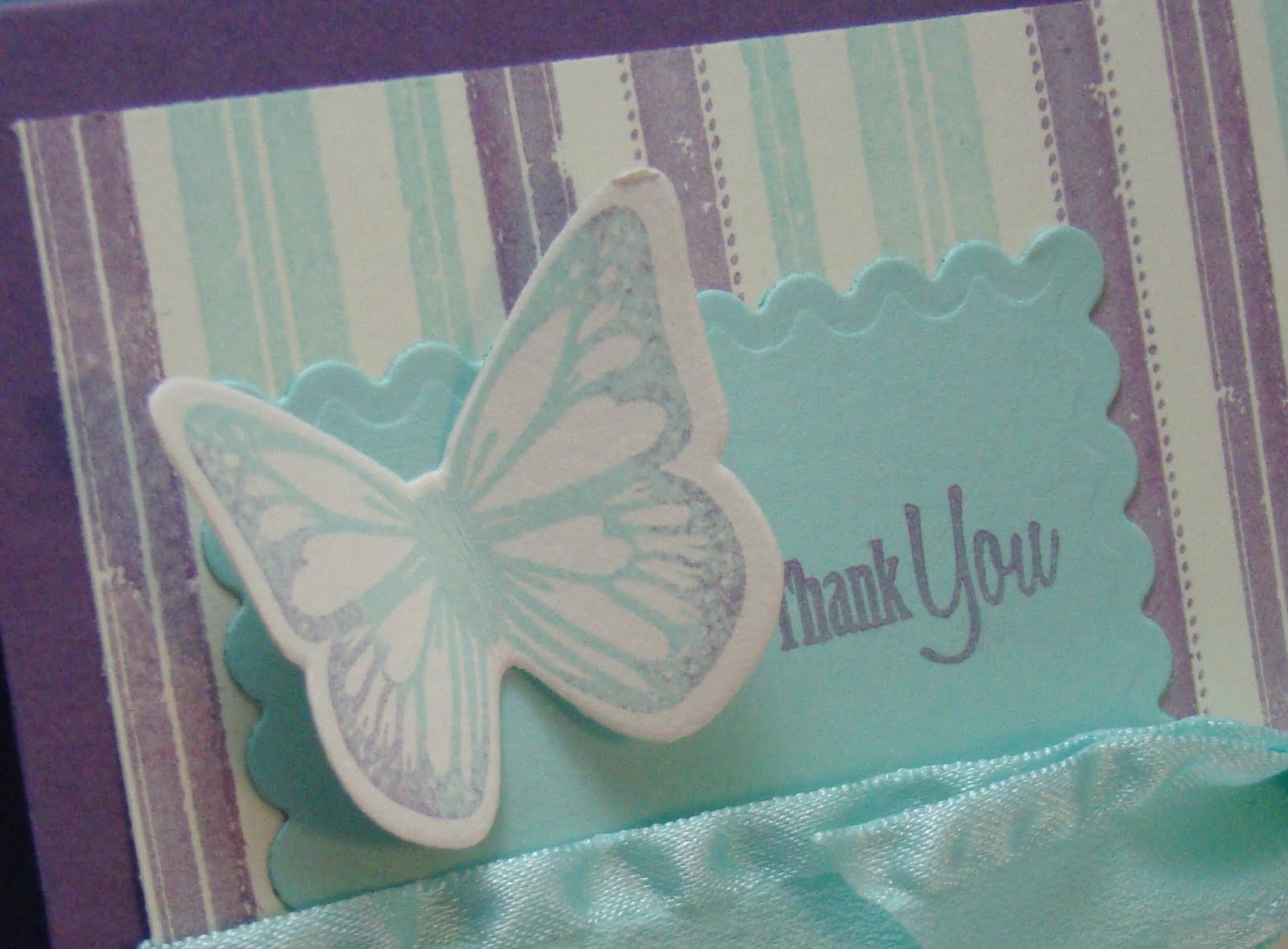
What says spring more than butterflies right?  I just love this tree from the PTI "Beyond Basic Borders" stamps set!  And the colors?  Yep, another favorite color combo!


These next three cards are so simple and were made within minutes!  And, let me tell you a secret...well, let me show you the first card and THEN I'll tell you a secret! :)


Pretty simple huh?  I used one of PTI's new Beautiful Blooms II dies to cut the flowers out.  See that paper?  Isn't it pretty?  Let me show you a closer view.


I don't own that paper pack.  PTI has this cool feature on their website called "Try Before You Buy".  If you scroll down to the bottom of each of their patterned paper packs, you will find this feature.  I have loved seeing this paper on other projects but it seems like the patterned paper makes it into my cart and then out again as I add "other" things.  So, I took PTI up on their offer and tried it.  I printed it onto PTI's white cardstock and then die cut the squares with the die.  It is PERFECT for the medium sized die!

I made several other cards using this same feature. 


This is another card using the Beautiful Blooms II die.  I used my Scor-pal to create the lines at the bottom and I bent the flower petals up just a bit to add a little extra visual interest to the card but to still keep the focus on the clean lines and flowers.


This paper is the new Green Boutique paper from PTI.  I did the same thing here and used the "Try Before You Buy" feature (but this one I did actually buy, I just haven't received it yet).

Thank you SO much for stopping by today! I'd love to hear what you think! Have you tried the "Try Before You Buy" feature before?

There are several other gals participating in this fun Spring blog hop.  Be sure to check out their blogs too!

Melisa Waldorf http://melisawaldorf.blogspot.com/
Kemi Schreiber http://kssdesigns.blogspot.com/
Kim Sears http://angelatmydoor.blogspot.com/
Amy Kolling http://www.stamp-n-paradise.blogspot.com/
Laurie Willison http://soapboxcreations.blogspot.com/
Pam Upper http://www.scrappypam.com/
Stacy Rogers http://stacy.typepad.com/

Supplies
Hello Card
Stamps: PTI Beyond Basic Borders, Butterfly Dreams, Fillable Frames 1
Paper:  PTI Raspberry Fizz, Aqua Mist
Ink:  Brilliance Moonlight White, PTI Raspberry Fizz, Jumbo Java VersaMagic
Other:  Ribbon, Pop Dots, Corner Chomper, Martha Stewart Border Punch

I'm So Grateful Card
Stamps:  PTI Signature Greetings
Paper:  PTI White, Pretty Pastels
Ink:  PTI Plum Pudding
Other:  Pop Dots, PTI Beautiful Blooms II Die

Birthday Wishes Cards
Stamps: PTI Asian Fusion

Paper: PTI White, Pretty Pastels
Ink: PTI Spring Rain
Other: Pop Dots, PTI Beautiful Blooms II Die, Scor-pal & Scor-bug

Thank You Card
Stamps:  PTI Signature Greetings, Fancy Flourishes
Paper:  PTI Aqua Mist & Green Boutique
Ink:  Champagne VersaMark, Giverny Green Palette
Other:  Pop Dots, Butterfly PTI Die

Saturday, March 20, 2010

A Dream Come True

This morning when I woke up I had a dream come true!  Nichole Heady, the owner of Papertrey Ink, whose stamps I LOVE and have been using constantly, featured my card on her blog!  Wow!  What an honor!  I'm elated!  You can see my card on her blog here.

When I made that card, I stamped half a sheet of the Guide Lines II in these same colors (and pattern) so that I could cut it up and use it to make several cards. This past week I made a second card using this same sheet and I have enough paper left to make one more. I love using the Guide Lines II stamp set! So many possibilities!  


I love the aqua mist color!  It's gorgeous!  When I put this together I wanted a sentiment that fit the softness of the card.  I don't like to make sympathy cards so I never have any on hand when I need them.  So, for this particular card, I pulled out the "So sorry for your loss" sentiment from "Vintage Picnic Sentiments" and added it to the bottom. 


Thank you so much for stopping by my blog today!  I appreciate each of you who take the time to visit and also for those of you who comment!  I hope you have a great day!

Supplies
Stamps:  PTI Guide Lines II, Vintage Picnic Sentiments
Paper:  Ultrasmooth White, PTI Aqua Mist & Guide Lines II Cardstock
Ink: Giverny Green Palette, Turquoise Gem VersaMagic, PTI Aqua Mist Hybrid
Other:  Ribbon, Fiskars Border Punch

Thursday, March 18, 2010

Hawaiian Shores Meet Asian Fusion

I got the newest ink and buttons from PTI today called Hawaiian Shores (hope to get the paper in the mail tomorrow).  I LOVE, LOVE this new color!  It is my favorite color yet!  Way to go PTI!

I made a simple card using Hawaiian Shores ink & buttons and PTI's stamp set "Asian Fusion".


What did I tell you?  Pretty color huh!  I wanted this card to just have a simplicity to it.  A calmness.  And, I think I accomplished that.  Instead of ribbon, I used buttons to accent the image...only 3 buttons on each side and then the image is popped up over the top of the largest buttons with pop dots.


The centers of the flowers are colored in with a white gel pen and I really like that look.  I also stamped one of the border images under the buttons but it is so light you can barely see it popping up above the buttons.  If I made this card again, I'd just leave that stamped strip off.  I also wanted to define the edges of the image panel and so I used one of the tea duo inks around the outside of it.  That added a little more depth to the card.  Can I say again how much I LOVE this color???? 


Thank you so much for stopping by!  It means a lot to me that you take the time to visit and also to comment!  I just love sharing this hobby with all of you!

Supplies
Stamps:  PTI Asian Fusion
Ink:  PTI Hawaiian Shores Pigment, Palette Noir, Brilliance Moonlight White, PTI Tea Duo Dye Inks
Paper:  PTI Kraft
Other:  Hawaiian Shore PTI Buttons, Pop Dots


Wednesday, March 17, 2010

Way to Go!

Here's a fun card that I made last week.  A friend came over to my house and we each made a card, based on a sketch.  She used traditional red, white & blue colors and I went with a softer color scheme. 

Here's my card:


I told my friend that it almost looks like a baby card with all the pastels.  The bow looks kind of funky in this picture but it looks good in real life.  I think I just got a weird angle on it when I took the photo.  I used PTI's "Tin Type" background set on the Spring Rain cardstock.  I love that background set so much!  The sentiment and star are from the "Star Prints" set and the flourish is from "Fanciful Flourishes".  This was the first time I used the new Plum Pudding pigment ink. I LOVE it!!  It is such a soft, pretty purple (and that is saying a lot for a KU Jayhawk fan)!


I used one of the Tea Dye Inks around the Spring Moss cardstock and I just really like the look that it gives the cardstock.

Here's the sketch from the Card Patterns blog that this card is based off of:


Thanks you so much for visiting my blog!  I hope you have a very good day!

Supplies
Stamps:  PTI Tin Type Background, Star Prints, Fanciful Flourishes
Paper:  PTI Plum Pudding, Spring Moss, Spring Rain
Ink:  Plum Pudding, Spring Rain
Other:  Spring Rain Button, Scrappers Floss, Fiskars Star Punch, Fiskars Upper Crest Border Punch, Pop Dots, PTI Plum Pudding Ribbon

Tuesday, March 16, 2010

One Layer Cards

A couple of weeks ago I challenged myself to make a few one-layer cards.  Two of the three of them turned out pretty well (or I think they did anyway).  The third, well you can't see that one.  Not so good! :)


This card uses an ususual color scheme of Hibiscus Burst, Giverny Green & Summer Sunrise.  I love that vine image from PTI's Beyond Basic Borders set!  It's perfect for this one layer card.  I added the sentiment and 2 gold beads to finish it off.  This would take no time at all to mass reproduce!


This next card is a little bit more involved and has such a soft feel to it.  I used Aqua Mist, Sweet Blush & Vintage Cream, along with a little Burnt Umber for this color scheme.  I cut the card a little smaller than a normal A2 card and then added the apron lace border along the bottom in Ivory.  I also inked the edges with the Burnt Umber ink.

Thanks for stopping by!  I'd love to hear what you think!

Supplies
Vines Card
Stamps:  PTI Beyond Basic Borders & Vintage Picnic Sentiments
Paper:  Kraft
Ink:  Palette Burnt Umber & Giverny Green, PTI Hibiscus Burst, & Summer Sunrise
Other: Silver Beads

This Year Card
Stamps:  PTI Guide Lines II, Signature Greetings
Ink:  Palette Burnt Umber, PTI Aqua Mist, Sweet Blush & Vintage Cream
Paper: Kraft & Ivory
Other:  Fiskars Apron Lace Border Punch
Related Posts Plugin for WordPress, Blogger...