I can't wait to show you some cards using them in action. But first, if you are anything like me you want to see them compared to current colors.
So today I am going to share with you half of the ink color comparisons and then tomorrow I will share the second half of color comparisons, so be sure to stop back by. I tried to pick the colors closest to the color hue of current colors. I hope that this will be a useful resource for you!
So, like I've done in the past with new ink releases, I have put together a series of photos that shows the new inks next to current inks in the Catherine Pooler collection. You can see all of the ink collection here. The new inks will be released on Wednesday, January 13th at 9 AM EST (or on Tuesday, January 12th for StampNation Members). Please note that new items linked in this post won't go live until the release.
I picked four of the new ink colors to share color comparisons of today. Keep in mind that I tried to get the photos as close as possible to the new colors but due to lighting and monitors the colors may be slightly off but it should still give you a good idea of how they compare to the other inks.
Up first is Pucker Up. This is a gorgeous hot pink!
I am in love with this color, Pucker Up! It's a color I've been waiting for and it is beautiful. It is more of a hot pink than Party Dress and a gorgeous compliment to Flirty Fuchsia.
Next, we have Do-si-do.
Do-si-do is a soft coral that is lighter than Coral Cabana and a great compliment to Samba.
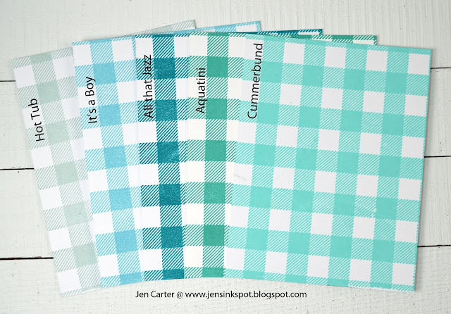
Meet my second favorite new ink color, Cummberbund. This is another color I've been waiting to add to my ink collection.
Ahhhh!! This Cummberbund is such a beautiful color! I've always loved Aquatini but wanted something even softer in this color family. So beautiful!
And last but not least for today is my absolute favorite new color, In the Park.
In the Park is such a pretty and unique color of green! It is a great compliment to Mardi Gras which is another beautiful and unique green.
I am so excited about these new colors and hope you are too! Tomorrow I will share the next four colors and a card made using them all so be sure to come back.
If you'd like to check out color comparisons for other Catherine Pooler ink colors, visit my Catherine Pooler Ink Comparisons Pinterest Board here.
The new inks & brushes are linked below. Please note that these won't go live in the store until Wednesday, January 13th at 9 AM EST (or on Tuesday, January 12th for StampNation Members).
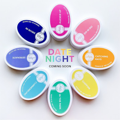
 Date Night Ink Pad Bundle Shop at: CP |
 Date Night Ink Pads & Refills Shop at: CP |
 Date Night Refills Bundle Shop at: CP |
 Pucker Up Shop at: CP |
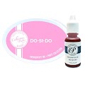 Do-Si-Do Shop at: CP |
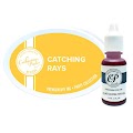 Catching Rays Shop at: CP |
 Chiffon Shop at: CP |
 In the Park Shop at: CP |
 Cummerbund Shop at: CP |
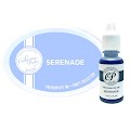 Serenade Shop at: CP |
 Drive In Shop at: CP |
 CP Blending Brushes Shop at: CP |
 Buffalo Plaid Background Stamp Shop at: CP |
Products I used on the samples on this post are linked above. Some of the links may be affiliate links which you can shop at no additional cost to you.
Thank you SO MUCH for stopping by my blog today! Have a great day!
_____________________________________________





No comments:
Post a Comment